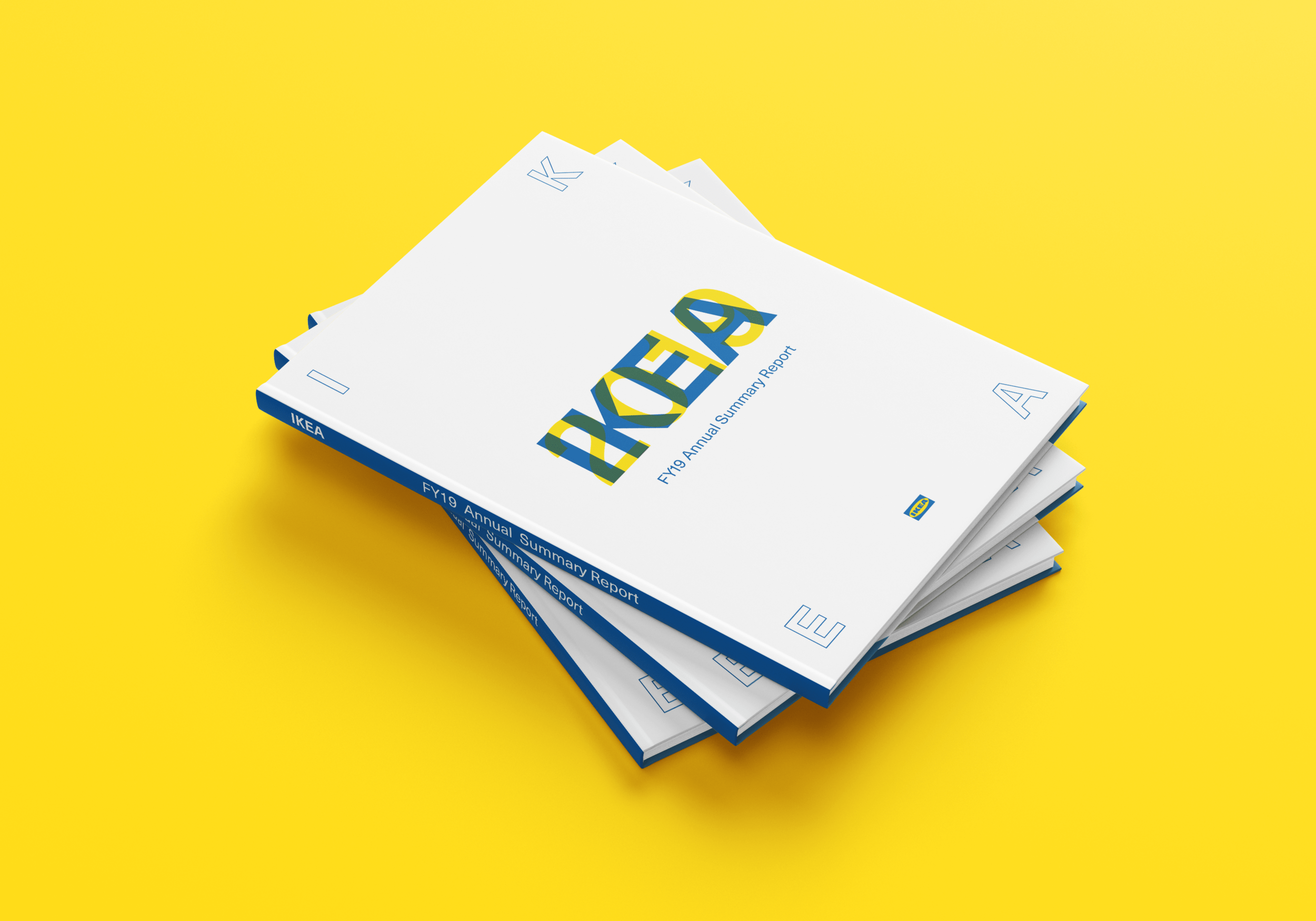
IKEA FY19 Annual Report Redesign
_
DATA VISUALIZATION
LAYOUT DESIGN
Course/
Type Systems
Timeline/
Spring 2020
Tools/
Adobe Photoshop
Adobe Illustrator
Adobe InDesign
Objective/
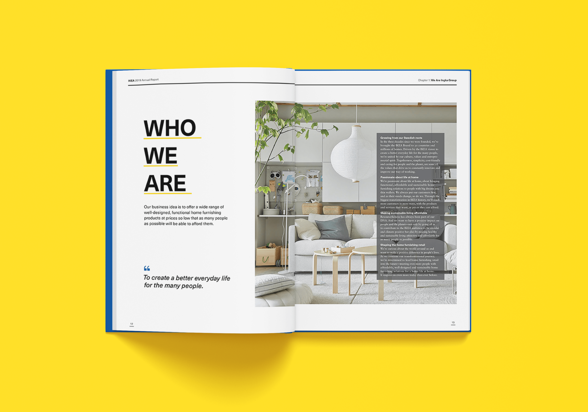
Redesign and enhance the annual report of a selected brand. For this project, I opted to redesign IKEA's annual report. IKEA is renowned for its affordable furniture characterized by simple and modern design aesthetics.
Approach/
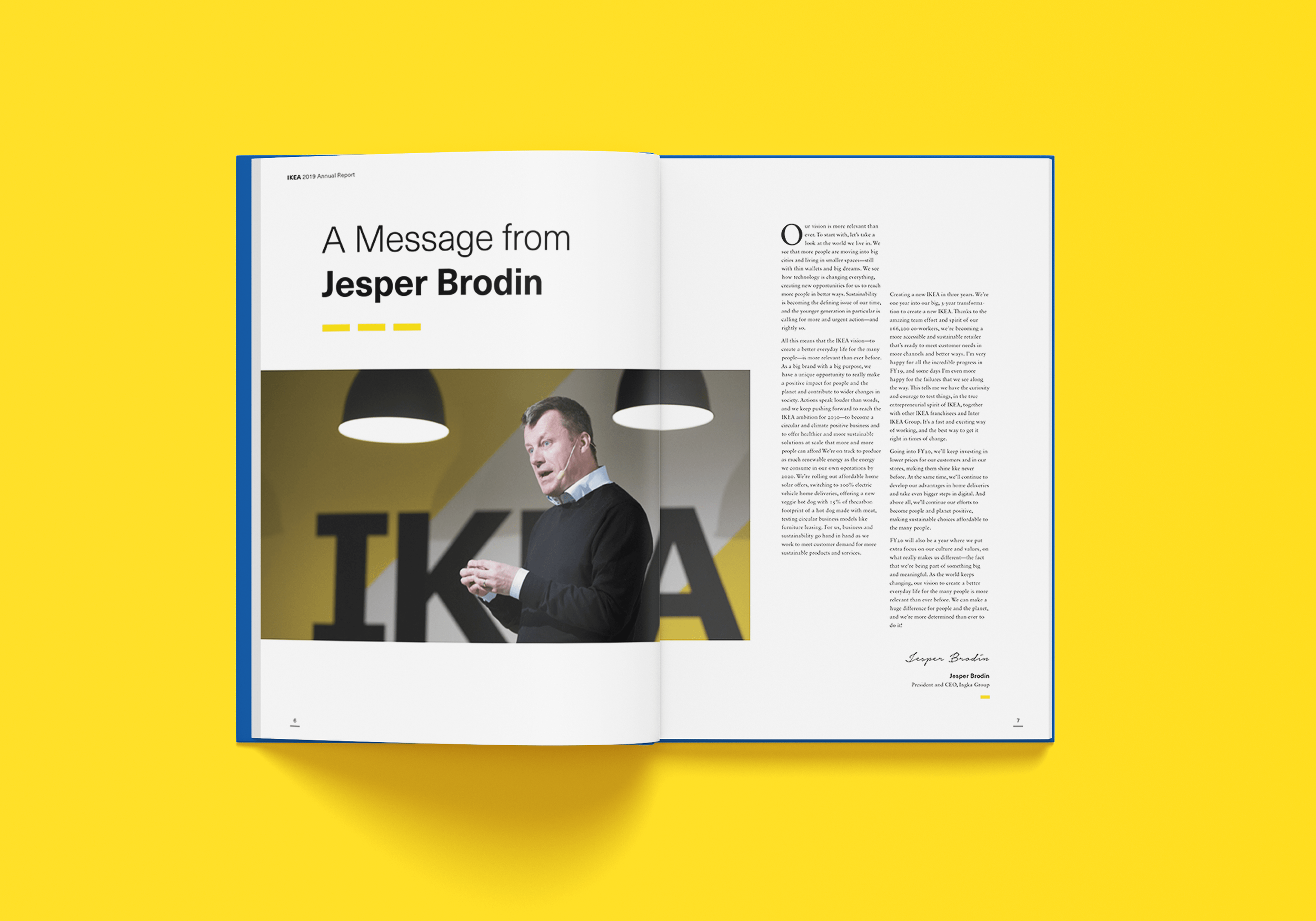
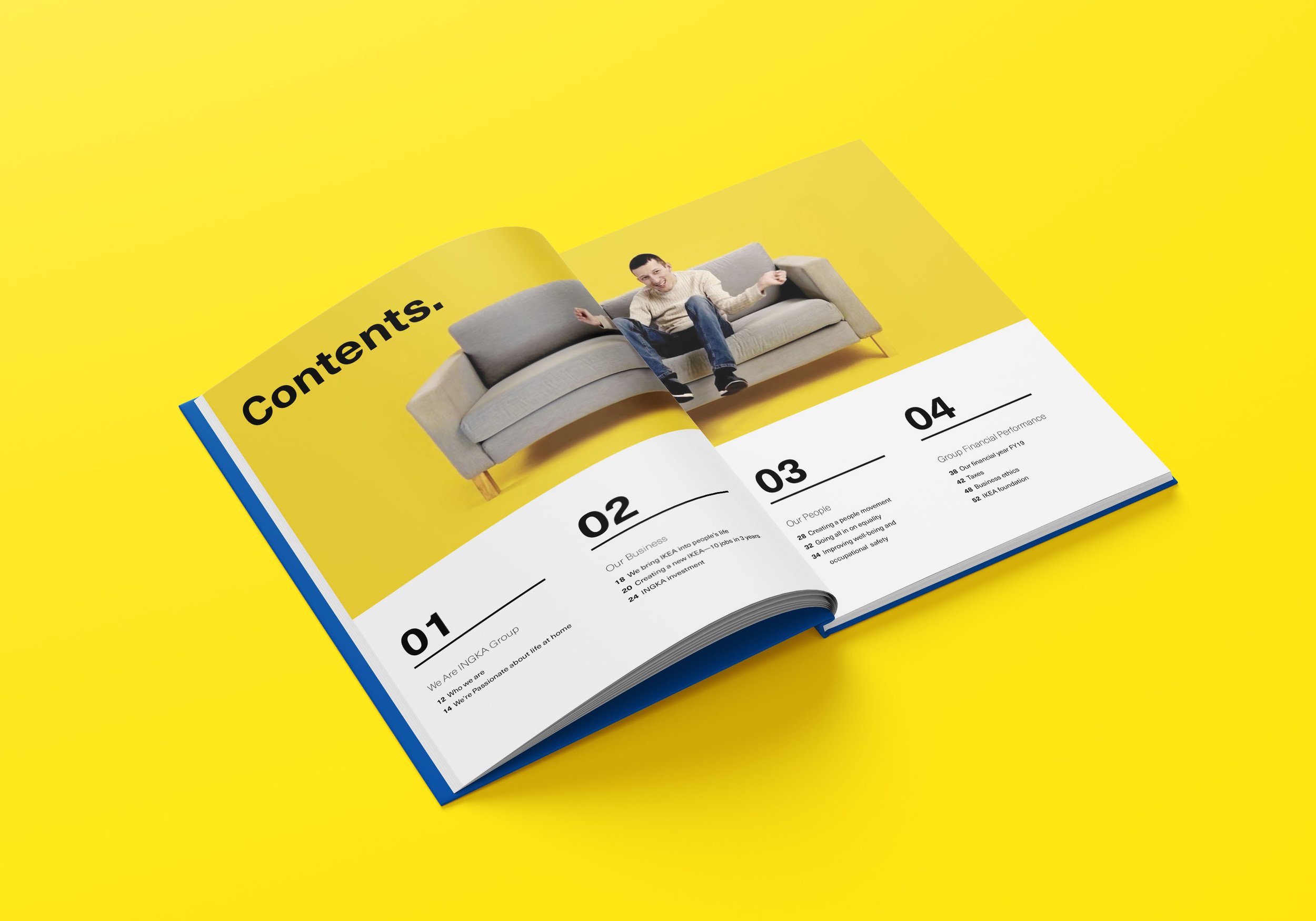
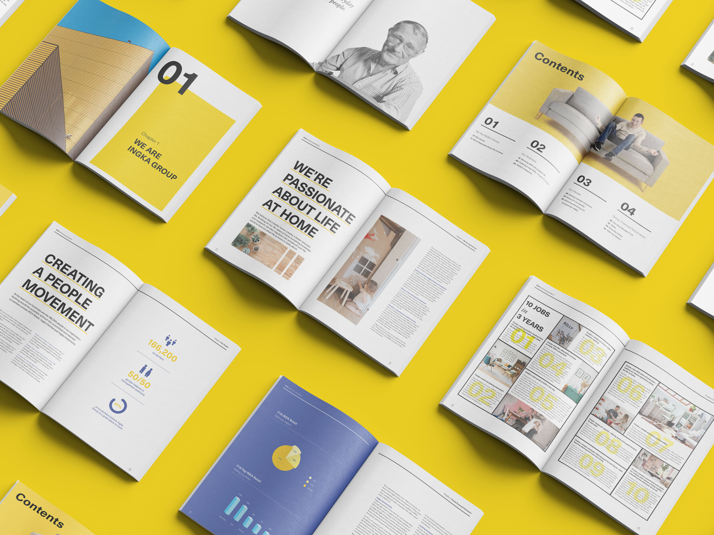
In general, most annual reports tend to be text-heavy and tedious to read. To address this, I strategically utilized white space to create more breathing room the layout, enhancing the legibility of the body copy and creating a more inviting reading experience.
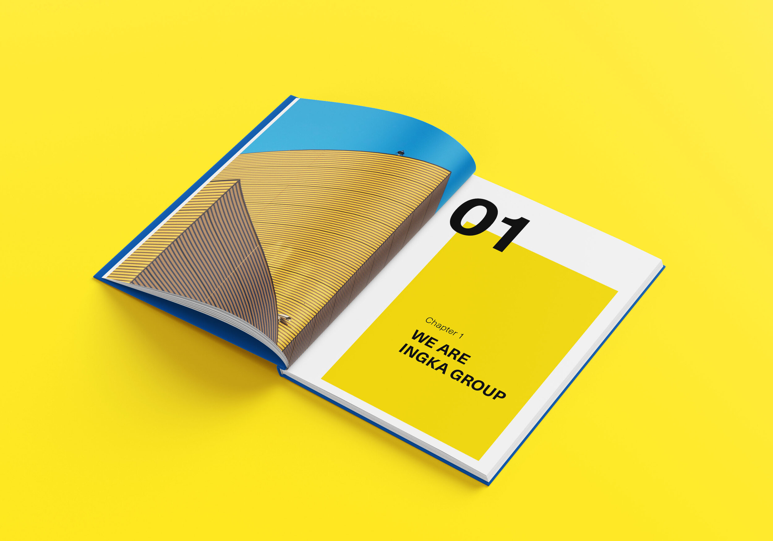
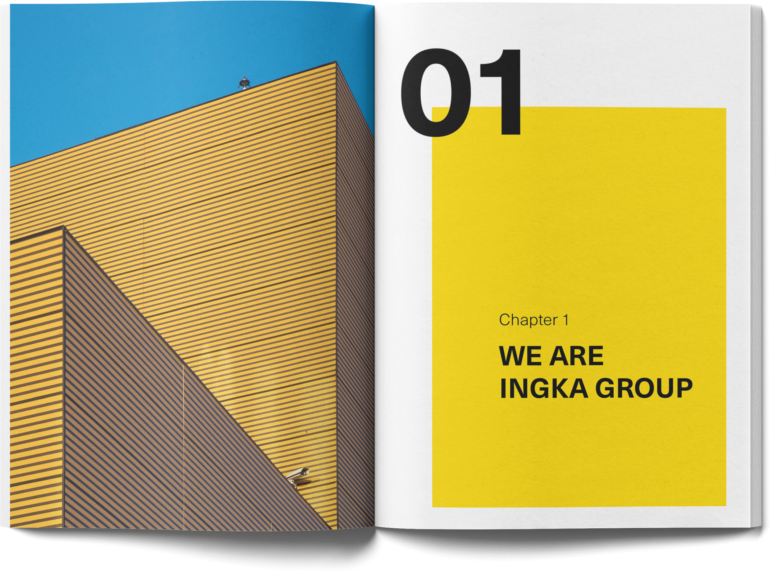
IKEA's signature color palette, yellow and blue, played a key role in maintaining a dynamic flow across the spreads. These vivid colors, combined with varying text sizes, added visual interest and cohesion throughout the report.
*DISCLAIMER: This is a student project created for academic purposes only and is not intended to represent or replace the original brand.
